Overview
Ubiquity is split into an App level and a Document level meaning that you can configure both the app and documents in the same platform. Inside the app level you can:
- View some statistics about your app
- View and manage content
- Configure apps
- Publish the app
- Manage users
- Message users
- View analytics
Some of these features will only be accessible to certain users.
Access the App Level
- Login to Ubiquity
- Click on your app
- Your app level might look something like this:

Accessing these tabs allows you to complete vital parts of the app creation and management processes.
See below for more information on each tab.
App Overview
The app Overview tab provides important information about the app, and quick access to key sections of Ubiquity.
The Overview tab includes:
- A Snapshot of how many documents the app contains and, if app user logins are enabled, how many active users the app has.
- Publishing statuses to indicate whether the app has been built for iOS, Android, and webapp.
- A Subscription status that indicates the billing arrangement for the app.
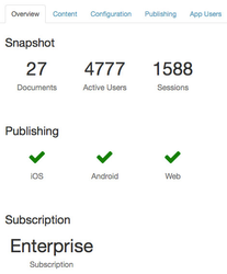
Clicking on a piece of information in the Overview tab will redirect you to the relevant Ubiquity page for that information. For instance, clicking on the iOS publishing status will take you to the iOS Publishing page.
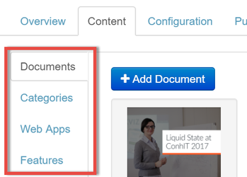
Content Tab
The Content tab houses options for importing, managing, and updating your app's content.
The Content tab contains four sections: Documents, Categories, Web Apps and Features.
| Expand | ||
|---|---|---|
| ||
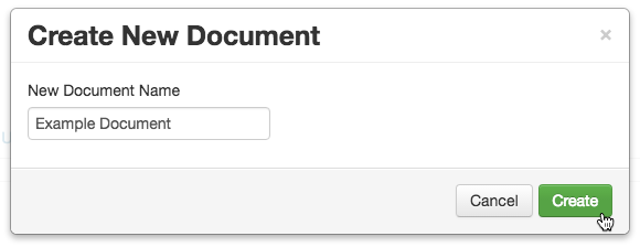
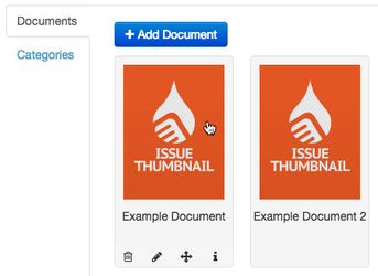
DocumentsDocuments are volumes of app content that are displayed in the main library screen of the app. Each document within an app has its own entry in the Content tab. To create a new document entry:
The document entry will be created. You can continue to import content to your document, configure it, and publish it to the app.
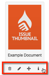
You can delete, move, edit, and view more info on an document entry by hovering your mouse over the document entry, then using the actions bar.
You can also reorder documents by dragging and dropping them in to the correct order. You can navigate directly to a document's Overview tab by clicking on the thumbnail image in the document entry.
|
| Expand | ||
|---|---|---|
| ||
CategoriesContent can either be presented in your app using a simple Library interface, or split in to distinct Categories.
For apps containing multiple sets of content, Categories help with app user navigation, ultimately leading to a better app user experience. The Categories section of the Content tab allows you add and manage Categories, and the content they contain. For information on enabling and managing Categories, see Categories. |

| Expand | ||
|---|---|---|
| ||
Web AppsA web app is a small website packaged for the app to display content, links, videos etc inside the app. Web Apps have the ability to:
A Web App must exist before the creation of a Feature as a Feature will take the existing Web App and display it in the app. A Web App is the flesh and the Feature the skeleton. |
| Expand | ||
|---|---|---|
| ||
FeaturesA Feature collects the Web App (mentioned above) and allows you to configure and display it in the app. It's like adding a new panel or cell into the app and that can be totally configurable inside the boundaries of HTML. |
Configuration Tab

The app level Configuration tab is used to configure your app's main details. Your app should be fully configured before you publish it.
For more information, see How to: Configure iOS & Android App.
Publishing Tab

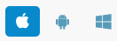
The app level Publishing tab allows you to build your app for iOS, Android and web app.
Click the iOS, Android, or Web app icon to enter the publishing section of the respective platform.
The publishing process varies across platforms. Please see App Release for more information.
App Users Tab

The App Users tab contains functions for administering app users. These functions are only available for private apps (which require users to log in prior to seeing the content library).
For more information, see Managing Users.
Messaging Tab

Push notifications are sent directly to users’ devices.
Once your app is published, you can use the push notifications tab to send a message to users of your app.
In order to send push notifications, you will need to configure your app with details from a OneSignal account. For instructions on creating a OneSignal account, see How to: Set up Push Notifications with OneSignal.
Once you have set up for push notifications service with OneSignal you can send messages to all platforms, or selected platforms.
For more information, see How to: Send Push Notifications.
Analytics Tab

The analytics tab contains valuable analytics on key app and content engagement metrics.
For information on App Analytics, see Ubiquity App Analytics.
App Entry Details
Aside from the options and information contained in the app-level tabs, it is also possible to edit the details of the app's entry in Ubiquity.
To do so, hover your cursor over the app entry's name. A grey pencil icon will appear - this is the edit button.
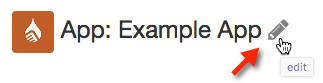
Clicking the edit button will allow you to edit the app entry's name, and choose a platform app icon for use as the default icon in Ubiquity.