Creating content for mobile and tablet apps is a bit different to creating content for desktop computers or hard-copy publications.
Here are some considerations you may want to take in to account when creating the content for your app. Click each point to see more.
| Expand | ||
|---|---|---|
| ||
Big files cause slower loading times. Pages which house images, videos, and other large files may cause the app interface to lag. You can usually save large images and videos as more efficient file types, without drastically affecting the file quality.
|
| Expand | ||
|---|---|---|
| ||
Not every user will access your app on a tablet. Many users will use your app on their smartphones, which have comparatively small screens. Try to avoid using small text, images, and interactive elements. Remember to always test your app on a smaller device before you finalise your content.
|
| Expand | ||
|---|---|---|
| ||
There isn't much point in adding interactivity to your pages if users don't know it is there. Try to include some sort of indication that your content is interactive where applicable. This can be done by adding an icon near interactive page elements, or even with an additional text frame that says something along the lines of 'tap me'.
|
| Expand | ||
|---|---|---|
| ||
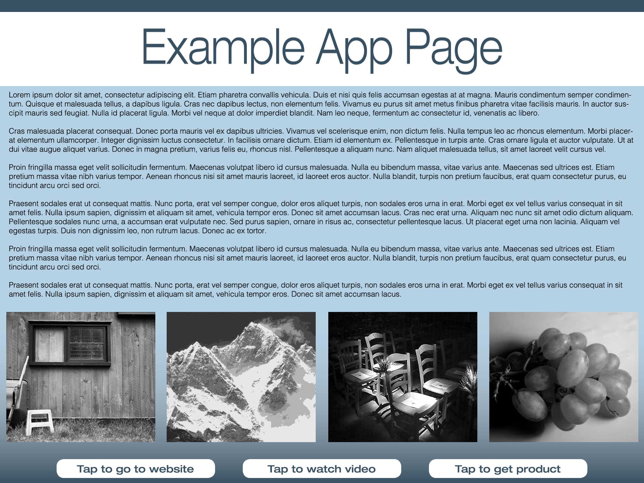
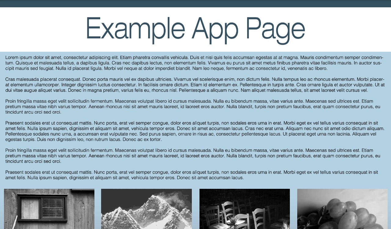
Different devices screens have different aspect ratios. It is wise to avoid designing your app content for a specific device. Other devices may not display the page in the same way. As always, it is best to thoroughly test your app content before finalising your designs. Here is an example of a page that was designed to fit an iPad in landscape orientation. The 'call to action' buttons on this page are positioned at the bottom of the screen.
Here, the same page is being viewed on an Android tablet with a different aspect ratio. See how the bottom of the page is cut off?
It is imposible difficult to cater for the display of every single mobile and tablet device on the market. However, it is possible to create content that is fairly agnostic in terms the placement of text, images, and other elements.
|
| Expand | ||
|---|---|---|
| ||
The iOS , and Android , and Windows Phone platforms will often have different ways of interpreting the same HTML. This means that some functionality - particularly advanced interactivity - may not work the same across different platforms. It is a good idea to run a basic test on the platforms you are targeting before you add any advanced interactivity to your app content.
|
| Expand | ||
|---|---|---|
| ||
Different import types are capable of different levels of interactivity. For instance, a Word document cannot achieve the same interactivity as content created from HTML created with in5. Before you begin creating your content, you should check that the type of source document you're creating will supper the interactivity you are aiming for. Detailed information on the interactivity available with each import type can be seen in this PDF: Liquid State Import Types vs Interactivity. Remember, advanced import types usually also require greater technical proficiency than basic or native imports. To find out which import type suits your needs and technical skill level, see Liquid State Ubiquity Import Types.
|
| Expand | ||
|---|---|---|
| ||
Before you finalise your content, you should always check you're taking the right approach. Have a look at the relevant Knowledge Base resources for the import type(s) you intend to use. For more information, see Liquid State Ubiquity Import Types. You might also find helpful information amongst our Frequently Asked Questions.
|