Creating content for mobile and tablet apps is a bit different to creating content for desktop computers or hard-copy publications.
Here are some considerations you may want to take in to account when creating the content for your app. Click each point to see more.
Different devices screens have different aspect ratios. It is wise to avoid designing your app content for a specific device. Other devices may not display the page in the same way. As always, it is best to thoroughly test your app content before finalising your designs.
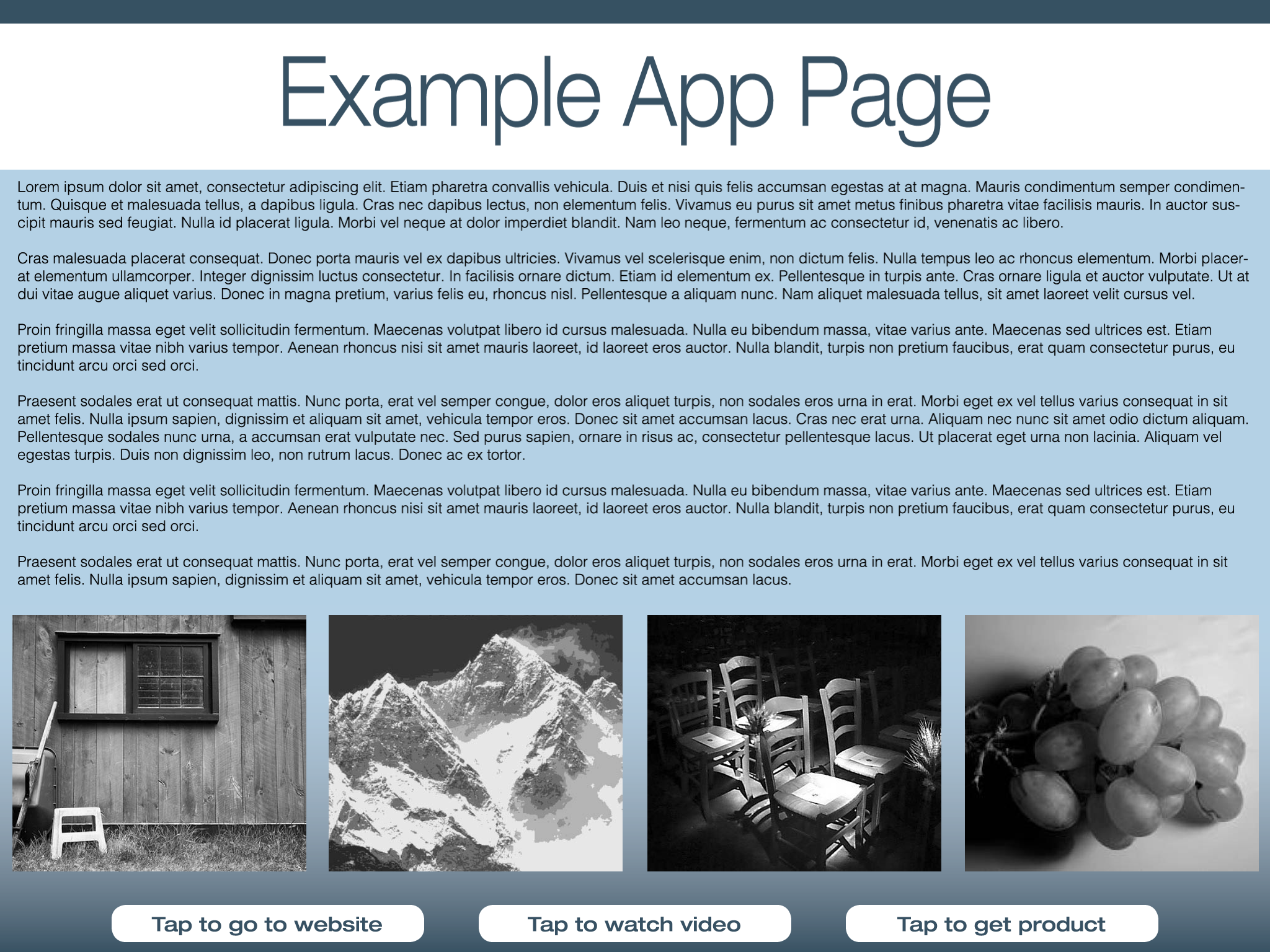
Here is an example of a page that was designed to fit an iPad in landscape orientation. The 'call to action' buttons on this page are positioned at the bottom of the screen.
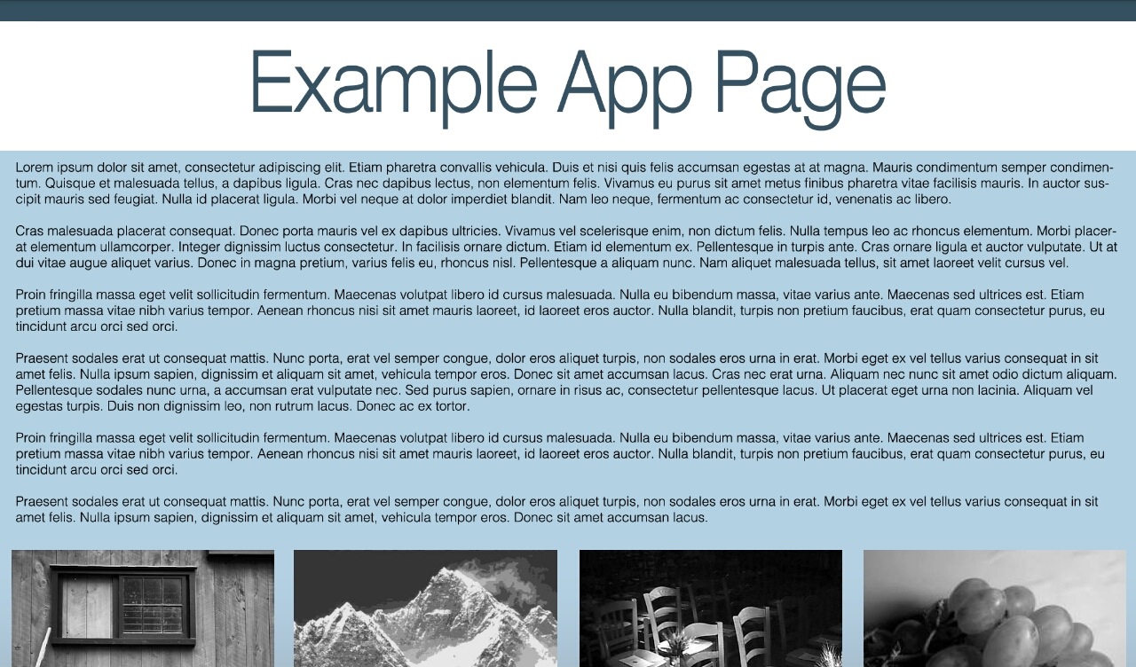
Here, the same page is being viewed on an Android tablet with a different aspect ratio. See how the bottom of the page is cut off?
It is imposible to cater for the display of every single mobile and tablet device on the market. However, it is possible to create content that is fairly agnostic in terms the placement of text, images, and other elements.